

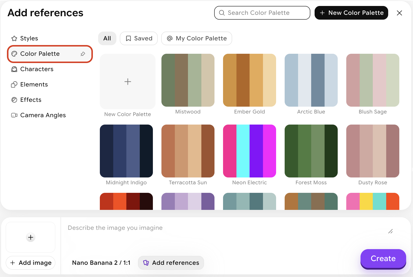
What Color Palettes does
When you upload a reference image, ImagineArt analyzes its dominant colors, tonal balance, and color relationships, and uses that analysis to guide the color output of your generation. Alternatively, you can choose a palette from the provided presets. The content of your image is defined by your prompt; the colors are anchored to your reference color palette. This is useful when you want chromatic consistency across a project — for example, keeping a brand’s color language intact across multiple generated visuals.How to use Color Palettes
Open Add References
In the image generation panel, click Add References to open the references modal.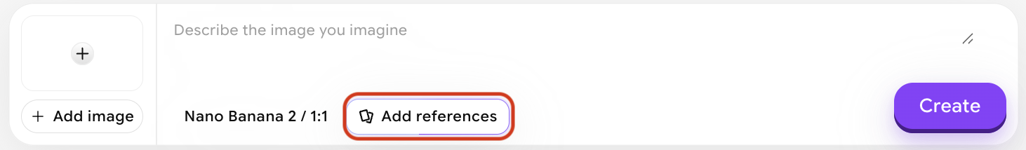
Create a new color palette
This opens a modal as shown below. You can either manually select and edit individual colors, or upload an image to extract colors from it — e.g., a logo.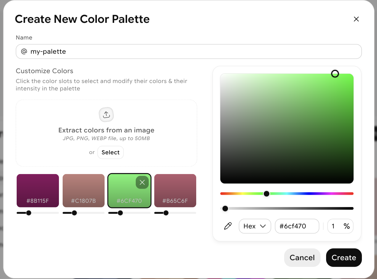
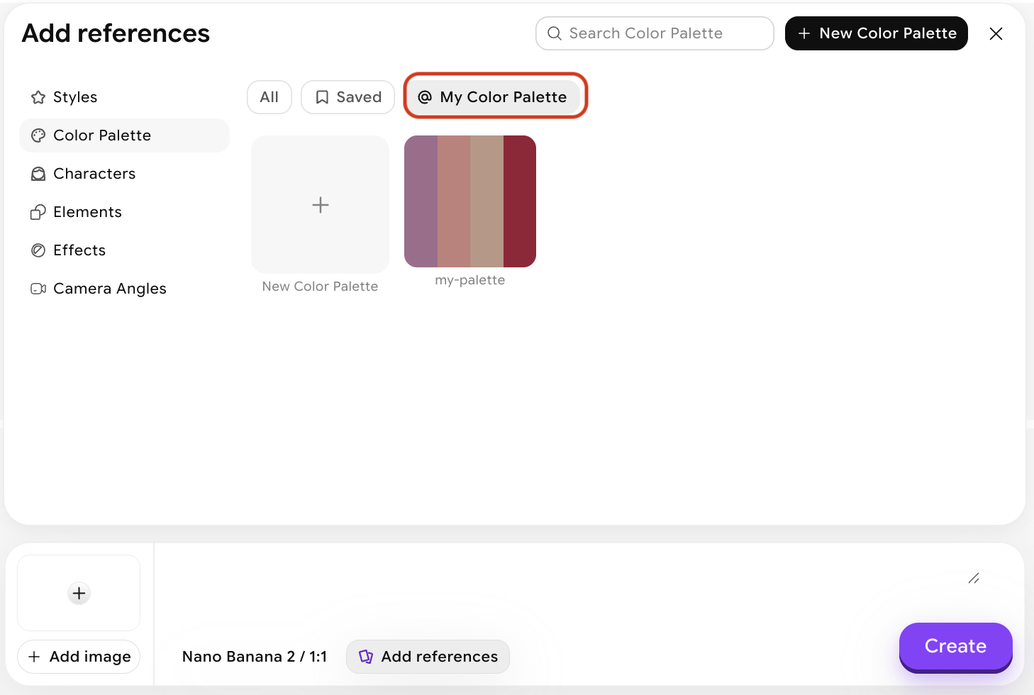
Name and create your palette
Once you’re happy with the colors and their intensity, give your palette a name and click Create.
Tips for better results
- Use images with a clear, intentional palette — mood boards, film stills, or artwork tend to produce cleaner color extraction than cluttered photos.
- Pair with Style — Color Palettes focuses on hue and tone; Style handles the full aesthetic. Using both together gives you fine-grained visual control.
- Try desaturated or monochromatic references to produce cohesive, restrained outputs — useful for editorial and brand work.
- The subject of your reference doesn’t need to match your prompt — a reference image of a sunset can apply its orange-gold palette to an architectural render or a portrait.